- by Inferndragon |
- Painting And Drawing
- | Submitted on 12/05/2008 |
- Skip


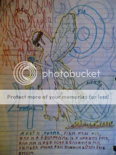
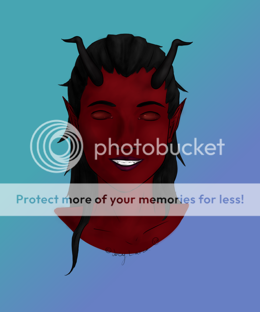
- Title: Leaves in the wind
- Artist: Inferndragon
- Description: I did this for a logo in my Creative and media diploma so i added this...
- Date: 12/05/2008
- Tags: leaves wind
- Report Post
Comments (7 Comments)

- Lenabla - 12/21/2009
- I can't see it. I'll have to judge by the preview.
- Report As Spam

- bawls09 - 02/23/2009
- I really like it. =D 5/5
- Report As Spam

- Joricu - 01/11/2009
- exactly how much wing is blowing there?
- Report As Spam

- DstaZ - 12/06/2008
- It looks alittle weird..
- Report As Spam

- RandomOrgasmicPoke - 12/06/2008
- i get the effect that u were going for but, it's way too effective. it's actually so blurry that it took me a while to figure out what it atually was even when u said what it was. it a good work of art and don't think that im tryna be mean...im just trying to help. if ur worried about effect, use a mixture of contrast along with what u just did with the blurry thing. if u lessen the blur then the effect will pop out alot more, as long as you focus on the contrast.
- Report As Spam