- by Eliza Letrange |
- Comics
- | Submitted on 12/05/2008 |
- Skip
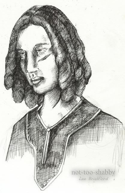

- Title: Leonard
- Artist: Eliza Letrange
-
Description:
Leonard from my webcomic, The Bend: http://www.drunkduck.com/The_Bend/
Doodled during anime club. Wanted to try for a bit more realism than I normally do. It didn't turn out like I had planned, but it still looks alright. Barring some anatomical issues, of course. - Date: 12/05/2008
- Tags: leonard
- Report Post
Comments (7 Comments)

- Intensive Walrus Unit - 02/04/2012
- I have to agree with Mewsey, but I'll try to have a little less implied bile in my comment. I do appreciate that it is rather realistic. The proportions are a tad bit awkward though, and I'm sure any other flaws have been previously covered.
- Report As Spam

- 1magi11 - 10/31/2011
-
sure this is a good but there is some error in it.
The nose. looks like it's taken from a person who is looking at you not to the side.
second. Me myself thinks it looks like the head has been a little cut of in the back wish makes it look like it was "suppose" to be viewed forward.
the eyes are a little off.
But this is nothing! you can make these few things better in NO TIME!
Everything else. Is totally ok I actually like the way you did the shading with the pen.
- Report As Spam

- Mewsey - 06/23/2011
- Ugh, how the ******** could people say this is amazing? It's not bad, but it's a little boring and uninspired... 3/5 The nose and eyes are definitely funny, work on those, for starters.
- Report As Spam

- iix- K I B A- xii - 08/11/2010
- 5/5
- Report As Spam

- oXPinkAngelXo - 08/10/2009
-
lolz
sry i think its kinda fny...lolz!!!
HAHAHA
im crying, im crying...
smile - Report As Spam

- Trinket Sixpence - 08/04/2009
- I'm not going to be a stupid-a** little suck-up like everyone else. It's not that great. I like the shading, though.
- Report As Spam

- lopipoppy - 05/21/2009
- 5/5
- Report As Spam