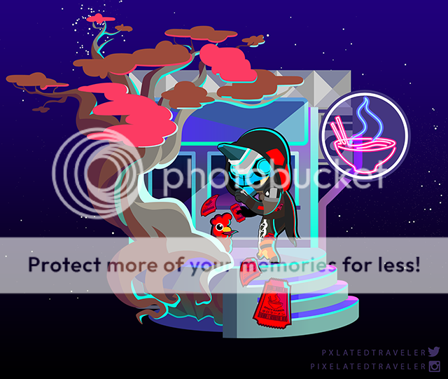
- by Vampenxwitch |
- Painting And Drawing
- | Submitted on 09/06/2008 |
- Skip
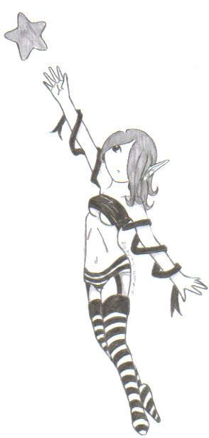
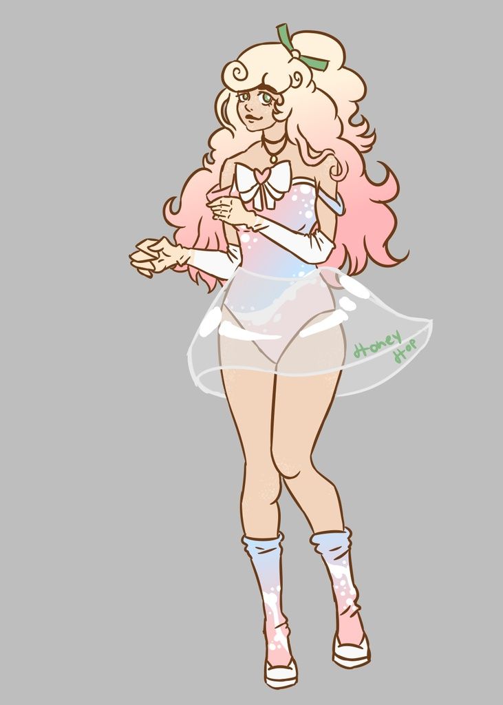
- Title: Catch a Star
- Artist: Vampenxwitch
- Description: ...
- Date: 09/06/2008
- Tags: catch star
- Report Post
Comments (7 Comments)
- tea and coffee - 08/23/2009
- I think this drawing is great biggrin . It's clear that the face is supposed to be wide and short, to convey a non-human exoticism and I don't think it should be changed.
- Report As Spam
- Ms A D A M - 01/31/2009
- I really enjoy this image it make me feel nice. But the eye is to far from the center point of this face the rib sticking out isn't to pleasing but that can be erased easy..and her face can be smaller and not a round. Other then that I love it I'll give you a 5/5 ^.^ keep drawing!
- Report As Spam
- Kampers - 01/26/2009
- lol we got a good judge here. ((the one under me ))
- Report As Spam
- Tea Party Massacres - 12/19/2008
- The face is too wide and short, she is too skinny, her rib cage sticks out at a weird angle on her right, and her eye is strangely shaped and placed too close to the edge of her face.
- Report As Spam
- Foxfire2009 - 12/13/2008
- Aw i think its cute! ^^ mad hearts!
- Report As Spam
- Kinichu - 09/07/2008
- Nice pose, but the outfit is sorta... strange.
- Report As Spam
- Vampenxwitch - 09/07/2008
- screw what you guys think!! Everyone on DeviantArt loves this one biggrin
- Report As Spam


