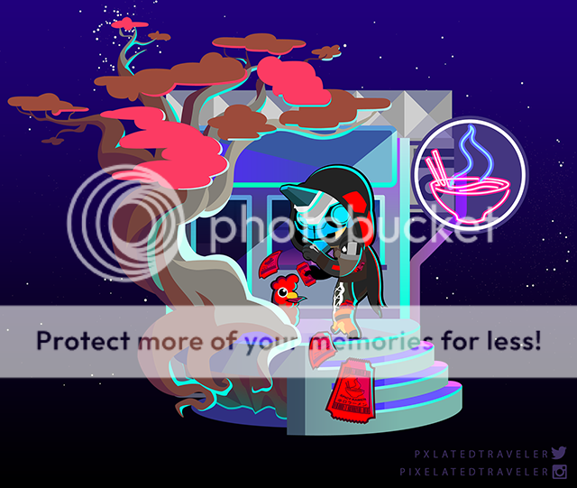
- by Serina Kairu |
- Painting And Drawing
- | Submitted on 09/01/2009 |
- Skip
- Title: G-Lulu II
- Artist: Serina Kairu
-
Description:
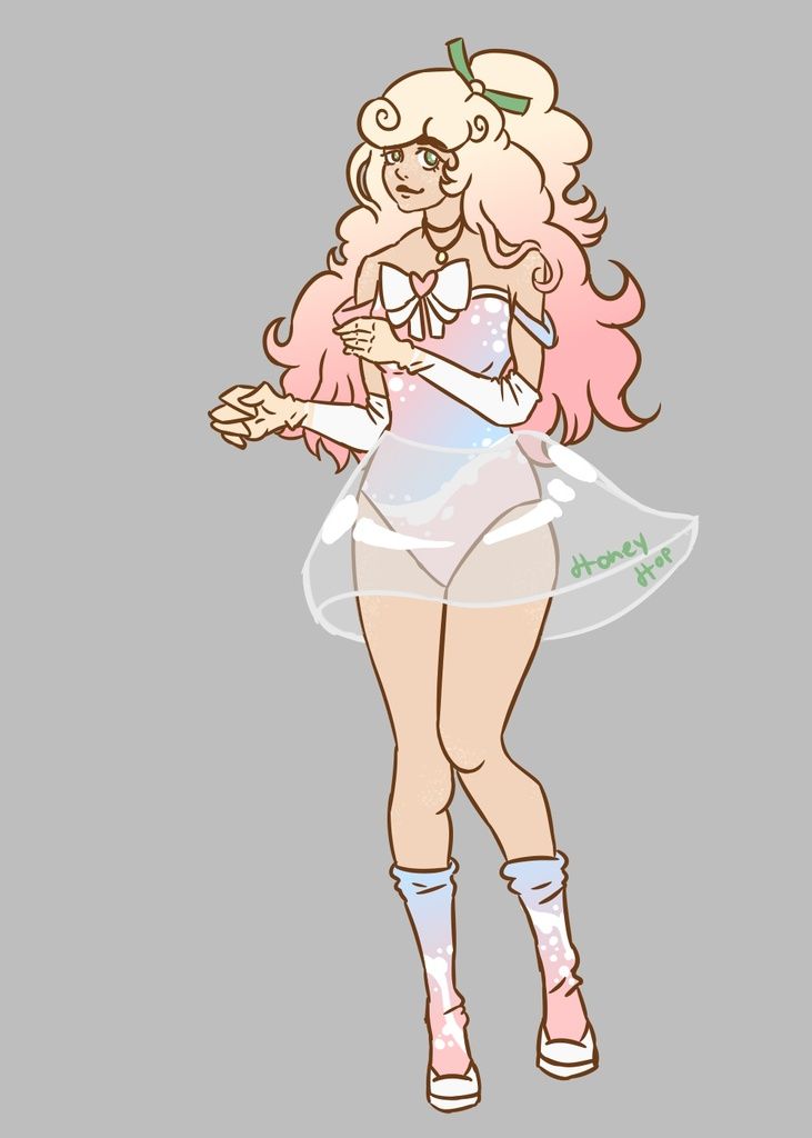
Another commission for G-Lulu II
I think the nose looks kinda screwed up.
Anyways. Visit my DA? :'D
harlequinzombies.deviantart.com - Date: 09/01/2009
- Tags: glulu commission nightmare bear feather
- Report Post
Comments (7 Comments)
- aishashow - 02/26/2010
- Nice!
- Report As Spam
- Shadowclaw16 - 10/01/2009
- its a bit awkward to look not to be mean the waist doesnt look right.... but its still an awesome sketch
- Report As Spam
- 4ngel5pawn - 09/01/2009
- cont. from below. More distracting to me (And still not bad) are the issues in the face. Remember that the eye size determines the scale and location of the EVERYTHING else on the head! The area between the eyes should only be 1 eye width, also shading in that area is critical. Although the nose does start at the eyebrow we do not perceive a hard line in the area between the eyes. ( As you currently have here. All my opinion. Ignore at will. YOU are the artist! I am only trying to be helpful. :-
- Report As Spam
- 4ngel5pawn - 09/01/2009
- I like the picture for it's genre. That said if you want her to look a little more realistic I would have a female friend bend at the waist in a similar pose and pay very close attention to the shadows. I think you have a small twist and a little foreshortening issue in the torso area that plays a little false to the viewers eye. Honestly it isn't a image breaker for me as "broken back syndrome" is common in images of women. More distracting to me (And still not really bad) is the placement and
- Report As Spam
- Hawkbri - 09/01/2009
- interesting :3 create another and maybe add to it?
- Report As Spam
- Haylyn73096 - 09/01/2009
- omg luv it!
- Report As Spam
- iiBeOreo - 09/01/2009
- Tis Nice!~* : D
- Report As Spam


