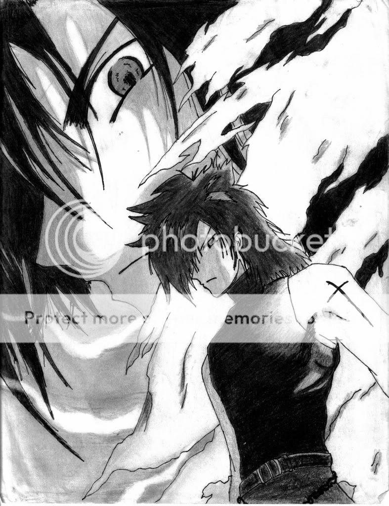
- Title: Vincent Valentine
- Artist: VincentVK
- Description: Let me know what you think. (i need some constructive critism)
- Date: 12/07/2008
- Tags: vincent valentine final fanastay
- Report Post
Comments (7 Comments)
- MJgwarrocker66 - 06/14/2009
- it is really,ishould say, kind of dark but it is really good. very talented. however, maybe it should have been a little more straight. like maybe a fuller head and the head should be striaght. i like the position you put the character in tho. i just think that the head sould be improved. other than that, the portrait you drew is phenominal.
- Report As Spam
- Zgamer49 - 06/01/2009
- It isn't bad. You have talent and should keep working at it.
- Report As Spam
- Casviel - 03/28/2009
-
Being a total fan of V.V., I'll have to say this isn't too flattering. The shading is coming along pretty well, but the body is slanted to the left, while the head seems to be slanting to the right. Looks a little odd.
I'd say 3/5. - Report As Spam
- NekoHugs - 12/08/2008
- 3/5. The body's kind of slanted. The head looks like part is missing at the top left.. Otherwise it's decent.
- Report As Spam
- wowfan67 - 12/08/2008
- it looks like the left top side of his head is missing but i give u a 4
- Report As Spam
- nerunerune - 12/08/2008
- The pencil shading is fairly good so far. You need to work on body structure though, he's leaning to the right in an awkward way. Keep trying and maybe use a model for body positioning.
- Report As Spam
- Spicy Oni - 12/07/2008
-
the shading on his cloak is good.
the rest is not bad but its still good ^_^
keep at it and u'll get better - Report As Spam


