- by promised_land |
- Painting And Drawing
- | Submitted on 12/10/2009 |
- Skip
- Title: designer
- Artist: promised_land
- Description:
- Date: 12/10/2009
- Tags: designer
- Report Post
Comments (3 Comments)
- Milk and Cookiezzz - 12/13/2009
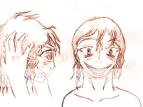
- He has big feet o-o
- Report As Spam
- promised_land - 12/12/2009
- the secret biggrin
- Report As Spam
- Captain Linda - 12/12/2009
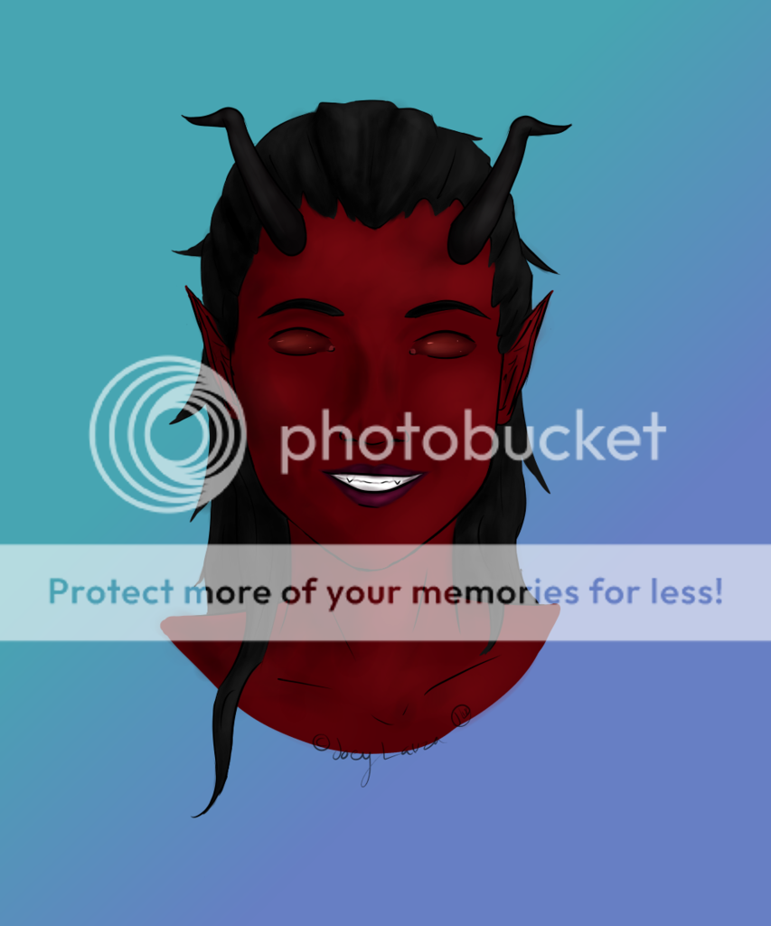
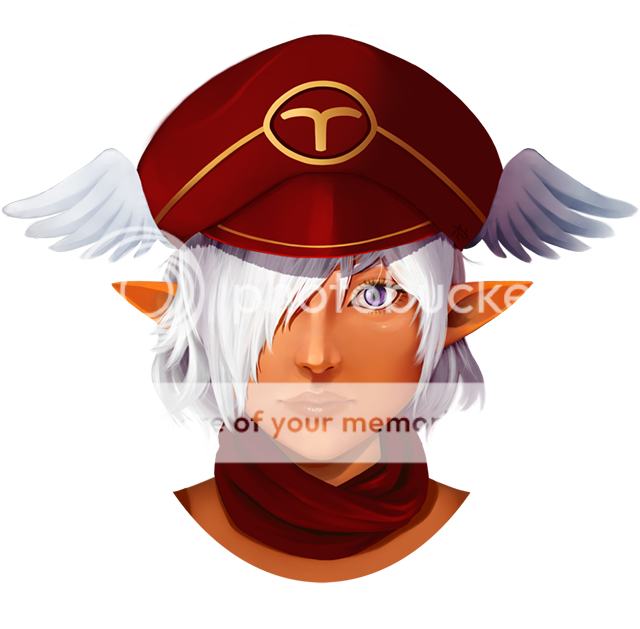
- It looks like he's leaning on something. Make his legs a bit more straight, instead of leaning forward. Legs should be more proportionate. Center his head or fix the shoulder ; that way he doesn't look like a hunchback. Make his arm longer, by a bit. Hands are always a pain to draw. Really like the head itself, though. Not sure if you intended to make that shading on his eyelid, but it really makes it look more realistic (shade-wise). What's in the paper? Mystery!
- Report As Spam


